| <!DOCTYPE> |
States document type and version of HTML ( Must be at the top ) |
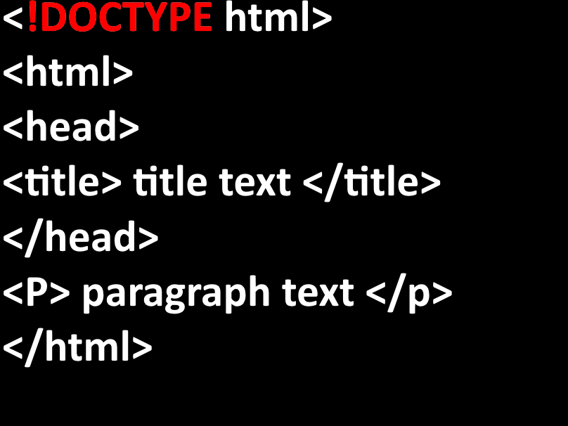 |
Declaration |
| <html> |
Wraps the HTML document |
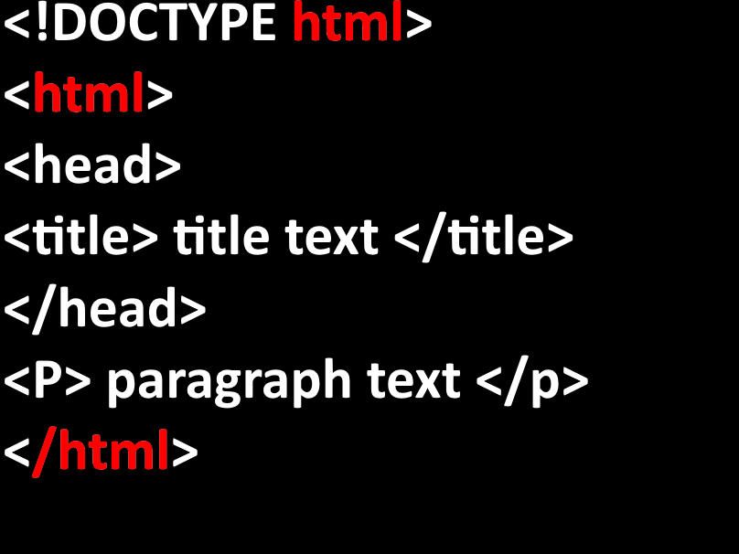 |
HTML Element |
| <head> |
Contains metadata, links to CSS, scripts/other head elements |
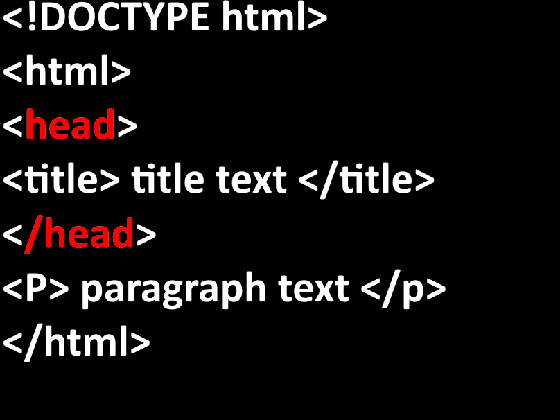 |
Document Metadata |
| <title> |
Names top bar in browser tabs |
 |
Document Metadata |
| <meta> |
(meta charset="UTF-8") Sets character encoding (ex UTF-8) /// (meta name="description") Describes the page (for browsers). /// (meta name="keywords") Keywords for SEO. /// (meta name="author") Names the author of website /// (meta name="viewport") Provides responsive layout for all screen sizes. |
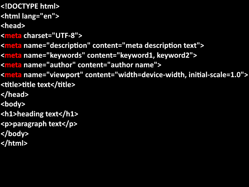 |
Document Metadata |
| <link> |
Defines the relationship of the current document and an external resource. |
 |
Document Metadata & External Resource |
| <style> |
Defines style information (CSS) for a document. |
|
Document Metadata & Embedded Style |
| <script> |
Used to embed executable code or data. (usually to embed or refer to JavaScript code) |
|
Script & Interaction |
| <base> |
Specifies base URL (and/or) target for all relative URLs in a document. |
|
Document Metadata & Base URL/td>
|
| <body> |
Defines main content of a page. Contains all elements displayed in the browser. |
|
Content Section & Layout |
| <header> |
Used for containing nav / intro items. |
|
Sectioning Content & Layout |
| <nav> |
Defines section of navigation links |
|
Sectioning Content & Layout/td>
|
| <main> |
Represents dominant content of a (body) of a document |
|
Sectioning Content & Layout |
| <section> |
Defines theme grouping of content. (usually with a heading, that represents a single piece of content) |
|
Sectioning Content & Layout |
| <article> |
Defines Self contained, independent content that can be distributed or reused on its own.(used for blogs, news, or forums usually) |
|
Sectioning Content & Layout |
| <aside> |
Represents content connected to the main content. |
|
Sectioning Content & Layout |
| <footer> |
Defines a footer for a document or a specific section (small words). |
|
Sectioning Content & Layout |
| <div> |
Organizes related elements into a single block. |
|
Generic Container & Layout |
| <span> |
Container to clean up a part of a text, or a part of a document.(does not break the flow of text) |
|
Generic Inline Container & Layout |
| <h1> to <h6> |
Defines headings by sizes 1-6. 1 being the largest and 6 being the smallest text. |
|
Heading & Text Content |
| <p> |
Defines a paragraph. Used at both ends of a text block. |
|
Sectioning Content & Text Content |
| <br> |
Inserts 'line break' (enter next line below previous line of text) within writing. Self-closing tag (does not require end tag).">Defines a paragraph. (style with CSS) |
|
Line Break & Text Content |
| <hr> |
"Horizontal Rule" defines theme breaks in content. Used to visually seperate sections of content within a website. |
|
Thematic Break & Text Content |
| <blockquote> |
Defines block of text that is quoted from an external source. |
|
Sectioning Content & Text Content |
| <pre> |
Defines preformatted text. |
|
Preformatted Text & Text Content |
| <code> |
Defines piece of computer code. Inline element displaying contents of a browsers default font. |
|
Computer Code & Text Content |
| <kbd> |
IIndicates keyboard input. Commonly used to define shortcuts (ex-ctrl+alt+del) |
|
User Input & Text Content |
| <samp> |
Represents sample output from a computer program. Often used to display results from a program as well as sample output. |
|
Sample Output & Text Content |
| <var> |
Defines mathematical variables in expressions or programming context. Content usually displayed in italics font. |
|
Variable & Text Content |
| <b> |
Used to make text BOLD. Only for visual purposes. |
|
Styling & Text Content |
| <strong> |
Defines strong importance, usually displayed in bold. Implise importance rather than just for style. |
|
Strong Importance & Text Content |
| <i> |
Used to make text italic. Only for visual purposes. |
|
Styling & Text Content |
| <em> |
(emphasis) displays emphasis in a text. Implise importance and emphasis. |
|
Emphasis & Text Content |
| <mark> |
Used to highlight a block of text. |
|
Highlighted Text & Text Content |
| <small> |
Used for reducing font size of text box. |
|
Fine Print & Text Content |
| <del> |
(deleted) Used to mark deleted text. |
|
Deleted Text & Text Content |
| <ins> |
(insert) used to mark text that has been inserted, usually displayed with an underline by default. |
|
Inserted Text & Text Content |
| <sub> |
(subscript) used to define subscript text, usually appearing slightly below surrounding text. |
|
Subscript & Text Content |
| <sup> |
(superscript) used to make text appear half a character above the normal line, sometimes smaller font. |
|
Superscript & Text Content |
| <ul> |
Used to present text as a bulleted list. |
|
Unordered List |
| <ol> |
(ordered list) used to present text as a numbered list. |
EXAMPLE HOVER |
Ordered List] |
| <li> |
|
|
List Item |
| <dl> |
PURPOSE HOVER |
|
Description List |
| <dt> |
PURPOSE HOVER |
|
Description Term |
| <dd> |
PURPOSE HOVER |
|
Description Definition |
| <a> |
PURPOSE HOVER |
|
Hyperlink |
| href="" |
PURPOSE HOVER |
|
Attribute of (a)...URL |
|
| target="_blank" |
PURPOSE HOVER |
|
Attribute of (a)...Browsing Context & Tab |
| <img> |
PURPOSE HOVER |
|
Embedded Image & Media |
| <picture> |
PURPOSE HOVER |
|
Responsive Image / Media |
| <source> |
PURPOSE HOVER |
|
Media Source / Media |
| <figcaption> |
PURPOSE HOVER |
|
Figure Caption / Media |
| <figure> |
PURPOSE HOVER |
|
Self-contained Content / Media |
| <audio> |
PURPOSE HOVER |
|
Audio Content / Media |
| <video> |
PURPOSE HOVER |
|
Video Content / Media |
| <track> |
PURPOSE HOVER |
|
Text Track for Media / Media |
| <embed> |
PURPOSE HOVER |
|
External Content / Media |
| <object> |
PURPOSE HOVER |
|
External Content / Media |
| <iframe> |
PURPOSE HOVER |
|
Inline Frame & Media |
| <form> |
PURPOSE HOVER |
|
Form Container & User Input |
| <input> |
PURPOSE HOVER |
|
Forms & Input |
| <textarea> |
PURPOSE HOVER |
|
Multiline Input & User Input |
| <button> |
PURPOSE HOVER |
|
Button Control & User Input |
| <select> |
PURPOSE HOVER |
|
Drop-down List & User Input |
| <option> |
PURPOSE HOVER |
|
Option in Select & User Input |
| <datalist> |
PURPOSE HOVER |
|
Predefined Options & User Input |
| <output> |
PURPOSE HOVER |
|
Result of Calculation & User Input |
| <progress> |
PURPOSE HOVER |
|
Progress Bar & User Input |
| <meter> |
PURPOSE HOVER |
|
Scalar Measurement & User Input |
| <script> |
PURPOSE HOVER |
|
Embedded Script & Script Interaction |
| <noscript> |
PURPOSE HOVER |
|
Fallback Content & Script Interaction |
| <canvas> |
PURPOSE HOVER |
|
Graphics Drawing & Script Interaction |
| <template> |
PURPOSE HOVER |
|
Template Content & Script Interaction |
| <slot> |
PURPOSE HOVER |
|
Web Component Slot & Script Interaction |
| <summary> |
PURPOSE HOVER |
|
Summary & Semantic |
| <details> |
PURPOSE HOVER |
|
Disclosure Widget & Semantic |
| <dialog> |
PURPOSE HOVER |
|
Dialog Box & Semantic |
| <time> |
PURPOSE HOVER |
|
Datetime & Semantic |
| <abbr> |
PURPOSE HOVER |
|
Abbreviation & Semantic |
| <cite> |
PURPOSE HOVER |
|
Citation & Semantic |
| <address> |
PURPOSE HOVER |
|
Contact Information & Semantic |
| <bdi> |
PURPOSE HOVER |
|
Bi-Directional Isolation & Semantic |
| <bdo> |
PURPOSE HOVER |
|
Bi-directional Override & Semantic |
| <data> |
PURPOSE HOVER |
|
Machine-readable Data & Semantic |
| <wbr> |
PURPOSE HOVER |
|
Word Break Opportunity & Semantic |
| <rp> |
PURPOSE HOVER |
|
Ruby Parentheses & Semantic |
| <rt> |
PURPOSE HOVER |
|
Ruby Text & Semantic |
| <ruby> |
PURPOSE HOVER |
|
Ruby Annotation & Semantic |